Internet of Things (IoT) has been the buzzwords of late. While
most people associate IoT with the collection of data using sensors and
transmitted to central servers, an integral part of IoT involves processing the
data collected. The ability to visualize data and make intelligent decisions is
the cornerstone of IoT systems.
Python is one of the preferred languages for data analytics, due
to its ease of learning and its huge community support of modules and packages
designed for number crunching. In this article, I am going to show you the
power of Python and how you can use it to visualize data.
Collection of Blood
Glucose Data
With the advancement in technologies, heathcare is one area that
is receiving a lot of attention. One particular disease – diabetes, garners a
lot of attention. According to the World Health Organization (WHO), the number
of people with diabetes has risen from 108 million in 1980 to 422 million in
2014. The care and prevention of diabetes is hence of paramount importance. Diabetics
need to regular prick their fingers to measure the amount of blood sugar in
their body.
For this article, I am going to show you how to visualize the
data collected by a diabetic so that he can see at a glance on how well he is
keeping diabetes in control.
Storing the Data
For this article, I am assuming that you have a CSV file named readings.csv, which contains the
following lines:
,DateTime,mmol/L
0,2016-06-01 08:00:00,6.1
1,2016-06-01 12:00:00,6.5
2,2016-06-01 18:00:00,6.7
3,2016-06-02 08:00:00,5.0
4,2016-06-02 12:00:00,4.9
5,2016-06-02 18:00:00,5.5
6,2016-06-03 08:00:00,5.6
7,2016-06-03 12:00:00,7.1
8,2016-06-03 18:00:00,5.9
9,2016-06-04 09:00:00,6.6
10,2016-06-04 11:00:00,4.1
11,2016-06-04 17:00:00,5.9
12,2016-06-05 08:00:00,7.6
13,2016-06-05 12:00:00,5.1
14,2016-06-05 18:00:00,6.9
15,2016-06-06 08:00:00,5.0
16,2016-06-06 12:00:00,6.1
17,2016-06-06 18:00:00,4.9
18,2016-06-07 08:00:00,6.6
19,2016-06-07 12:00:00,4.1
20,2016-06-07 18:00:00,6.9
21,2016-06-08 08:00:00,5.6
22,2016-06-08 12:00:00,8.1
23,2016-06-08 18:00:00,10.9
24,2016-06-09 08:00:00,5.2
25,2016-06-09 12:00:00,7.1
26,2016-06-09 18:00:00,4.9
The CSV file contains rows of data that are divided into three
columns – index, date and time, and blood glucose readings in mmol/L.
Reading the Data in Python
While Python supports lists and dictionaries for manipulating
structured data, it is not well suited for manipulating numerical tables, such
as the one stored in the CSV file. As such, you should use pandas. Pandas is a software library written for Python for data
manipulation and analysis.
Let’s see how pandas work. Note that for this article, I am using
IPython Notebook for running my Python script. The best way to use IPython
Notebook is to download Anaconda (
https://www.continuum.io/downloads).
Anaconda comes with the IPython Notebook, as well as pandas and matplotlib
(more on this later).
Once Anaconda is installed, launch the IPython Notebook by typing
the following command in Terminal:
$ ipython notebook
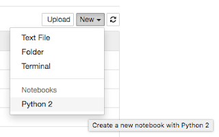
When IPython Notebook has started, click on New | Python 2:
Type the following statements into the cell:
import pandas as pd
data_frame =
pd.read_csv('readings.csv', index_col=0, parse_dates=[1])
print data_frame
You first import the pandas
module as pd, then you use the read_csv() function read the data from
the CSV file to create a dataframe.
A dataframe in pandas behaves like a
two-dimensional array, with an index for each row. The index_col parameter specifies which column in the CSV file will be
used as the index (column 0 in this case) and the parse_dates parameter specifies the column that should be parsed as
a datetime object (column 1 in this
case). To run the Python script in the cell, press Ctrl-Enter.
When you print out the dataframe, you should see the following:
DateTime mmol/L
0 2016-06-01 08:00:00 6.1
1 2016-06-01 12:00:00 6.5
2 2016-06-01 18:00:00 6.7
3 2016-06-02 08:00:00 5.0
4 2016-06-02 12:00:00 4.9
5 2016-06-02 18:00:00 5.5
6 2016-06-03 08:00:00 5.6
7 2016-06-03 12:00:00 7.1
8 2016-06-03 18:00:00 5.9
9 2016-06-04 09:00:00 6.6
10 2016-06-04 11:00:00
4.1
11 2016-06-04 17:00:00
5.9
12 2016-06-05 08:00:00
7.6
13 2016-06-05 12:00:00
5.1
14 2016-06-05 18:00:00
6.9
15 2016-06-06 08:00:00
5.0
16 2016-06-06 12:00:00
6.1
17 2016-06-06 18:00:00
4.9
18 2016-06-07 08:00:00
6.6
19 2016-06-07 12:00:00
4.1
20 2016-06-07 18:00:00
6.9
21 2016-06-08 08:00:00
5.6
22 2016-06-08 12:00:00
8.1
23 2016-06-08 18:00:00
10.9
24 2016-06-09 08:00:00
5.2
25 2016-06-09 12:00:00
7.1
26 2016-06-09 18:00:00
4.9
You can print out the index of the dataframe by using the index property:
print data_frame.index
You should see the index as follows:
Int64Index([ 0, 1, 2,
3, 4, 5,
6, 7, 8, 9,
10, 11, 12, 13, 14, 15, 16,
17, 18, 19, 20,
21, 22, 23, 24, 25, 26],
dtype='int64')
You can also print out the individual columns of the dataframe:
print data_frame['DateTime']
This should print out the DateTime
column of the dataframe:
0 2016-06-01 08:00:00
1 2016-06-01 12:00:00
2 2016-06-01 18:00:00
3 2016-06-02 08:00:00
4 2016-06-02 12:00:00
5 2016-06-02 18:00:00
6 2016-06-03 08:00:00
7 2016-06-03 12:00:00
8 2016-06-03 18:00:00
9 2016-06-04 09:00:00
10 2016-06-04 11:00:00
11 2016-06-04 17:00:00
12 2016-06-05 08:00:00
13 2016-06-05 12:00:00
14 2016-06-05 18:00:00
15 2016-06-06 08:00:00
16 2016-06-06 12:00:00
17 2016-06-06 18:00:00
18 2016-06-07 08:00:00
19 2016-06-07 12:00:00
20 2016-06-07 18:00:00
21 2016-06-08 08:00:00
22 2016-06-08 12:00:00
23 2016-06-08 18:00:00
24 2016-06-09 08:00:00
25 2016-06-09 12:00:00
26 2016-06-09 18:00:00
Name: DateTime, dtype: datetime64[ns]
Likewise, you can also print the mmol/L column:
print data_frame['mmol/L']
You should see the following:
0 6.1
1 6.5
2 6.7
3 5.0
4 4.9
5 5.5
6 5.6
7 7.1
8 5.9
9 6.6
10 4.1
11 5.9
12 7.6
13 5.1
14 6.9
15 5.0
16 6.1
17 4.9
18 6.6
19 4.1
20 6.9
21 5.6
22 8.1
23 10.9
24 5.2
25 7.1
26 4.9
Name: mmol/L, dtype: float64
Visualizing the Data
Let’s now try to visualize the data by displaying a chart. For
this purpose, let’s use matplotlib.
Matplotlib is a plotting library for the Python language and is integrated
right into pandas.
Add the following statements in bold to the existing Python
script:
%matplotlib inline
import pandas as pd
import numpy as np
data_frame = pd.read_csv('readings.csv', index_col=0,
parse_dates=[1])
print data_frame
print data_frame.index
print data_frame['DateTime']
print data_frame['mmol/L']
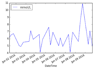
data_frame.plot(x='DateTime',
y='mmol/L')
The “%matplotlib
inline” statement instructs IPython notebook to plot the matplotlib
chart inline. You can directly plot a chart using the dataframe’s plot() function. The x parameter specifies the column to use
for the x-axis and the y parameter
specifies the column to use for the y-axis.
This will display the chart as follows:
You can add a title to the chart by importing the matplotlib module and using the title() function:
%matplotlib inline
import pandas as pd
import numpy as np
import matplotlib.pyplot
as plt
data_frame = pd.read_csv('readings.csv', index_col=0,
parse_dates=[1])
print data_frame
print data_frame.index
print data_frame['DateTime']
print data_frame['mmol/L']
data_frame.plot(x='DateTime', y='mmol/L')
plt.title('Blood Glucose
Readings for John', color='Red')
A title is now displayed for the chart:
By default, matplotlib will display a line chart. You can change
the chart type by using the kind
parameter:
%matplotlib inline
import pandas as pd
import numpy as np
import matplotlib.pyplot as plt
data_frame = pd.read_csv('readings.csv', index_col=0,
parse_dates=[1])
print data_frame
print data_frame.index
print data_frame['DateTime']
print data_frame['mmol/L']
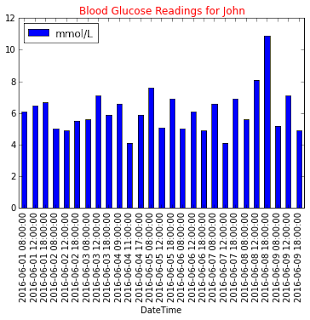
data_frame.plot(kind='bar',
x='DateTime', y='mmol/L')
plt.title('Blood Glucose Readings for John', color='Red')
The chart is now changed to a barchart:
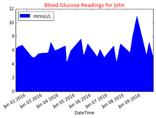
Besides displaying as a barchart, you can also display an area
chart:
data_frame.plot(kind='area',
x='DateTime', y='mmol/L')
The chart is now displayed as an area chart:
You can also set the color for the area chart by using the color parameter:
data_frame.plot(kind='area', x='DateTime', y='mmol/L', color='r')
The area is now in red:
Learning More
This article is just touching on the surface of what Python can
do in the world of data analytics. To learn more about using Python for data
analysis, come join my workshop (
Introduction to Data Science using Python) at
NDC Sydney 2016 on the 1-2 August 2016.
See you there!


 While it is never
too late to start learning programming, the ideal age is to start as early as
possible. And it is the exact motivation for this course.
While it is never
too late to start learning programming, the ideal age is to start as early as
possible. And it is the exact motivation for this course.


